Debuting in 2009, Borderlands quickly became a defining shooter for its generation. With massive sci-fi settings, explosive gunplay, and a cheeky sense of humor that is quick to go as silly as it becomes grim, the success of Borderlands quickly made it perfect for a franchise. Borderlands stands out from most other gaming franchises by embracing a cartoonish take on the wasteland aesthetic. It’s a fitting look for a series that has a lot of fun playing the over-the-top setting for all its worth, throwing players into a bombastic world of Vault Hunters, weapons manufacturers, and alien creatures.
Videos by ComicBook.com
The art design of the game is a big part of that appeal for the Borderlands series, a quickly established and very effective means of conveying the tone of the series from the get-go. It’s also something that came about at the last minute. According to Take-Two CEO Strauss Zelnick, it was a last-minute decision that cost a lot of money – and was a crucial final step in elevating the game into a genuine hit. Here’s how the decision to give Borderlands a cel-shaded aesthetic came into play and why it was the right decision for Take-Two despite the massive cost.
The Cel-Shaded Aesthetic Of Borderlands Was A Last-Minute Decision

During a lengthy interview that Zelnick gave with David Senra, the Take-Two CEO reflected on his career as a whole — including the last-minute choice to change up Borderland’s art design. Initially, Borderlands had a more realistic art design akin to most other shooters of the era. However, with just a few months left in development before Borderlands was set to launch, the developers approached Take-Two with a wild idea: completely overhauling the visuals of the game and going for more of a stylized aesthetic that used cel-shaded character designs.
Their argument was that the realistic look wasn’t working for the game they had created. The team came to Zelnick with this request, claiming it was key to making the game work – and that it would cost an additional $50 million. After consideration, Zelnick agreed to the request – which proved to be a good call, as it helped the game stand out from the sea of other shooters that were out in the era. Zelnick believes that if they had stuck their heels in and kept the original art style, the game would have suffered and wouldn’t have been able to become the massive franchise it would transform into. The thing is, he was completely right.
Borderlands Needed The Visuals To Really Seal The Deal
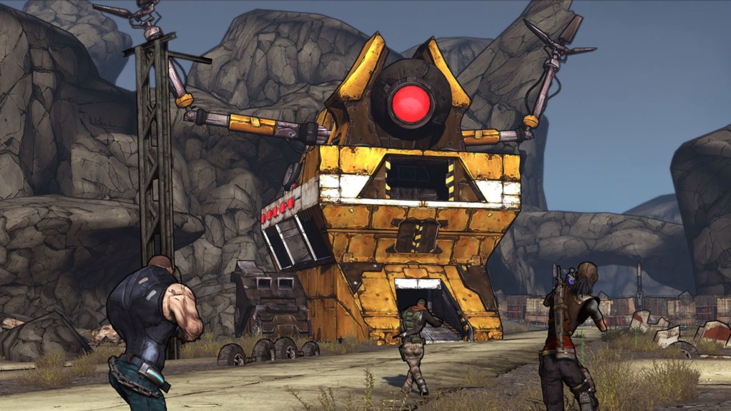
Borderlands without that cel-shaded aesthetic simply wouldn’t have felt like Borderlands. The series has thrived in part to its unique sense of identity and tone, with a gallows sense of humor that is nevertheless bolstered by a goofy sense of abandon. It’s Mad Max by way of Wind Waker, which helped it stand out from all the other grim games that explored similar subject matter or worlds. It lent the games a natural bombast that benefited the game design. The flashing numbers for successful hits might have felt odd in a realistic shooter, but it blends together into the cacophony of color that makes up most Borderlands firefights.
The cel-shaded style fit the gameplay’s quick pace and over-the-top action, making for a game that felt appropriately silly when it wanted to. It also helped make the characters all pop against the backgrounds, subverting a common complaint of the gritty shooters. Borderlands is a game where every character pops with instant personality; the character design goes a long way towards making characters clear from the jump. That works for gameplay and the story itself, where each character is a wild over-the-top take on an archetype, allowing the heroes to be weird and the villains to be twisted, hilarious, and memorable.
It all gave Borderlands a sense of immediate personality, something that many shooters of the era — defined by the shadows of gritty cover shooters like Gears of War or hard-nosed military games like Call of Duty — could lack. It was a style that the developers soon found themselves able to experiment with, whether that be in character type or storytelling impulse. Characters like Tiny Tina feel perfectly attuned to Borderlands but wouldn’t have worked nearly as well in a more realistic-looking game. That cartoony sense of abandon worked in Borderlands‘ favor.
It even left the door open for developers like TellTale to do their own thing with the franchise, using that tonal starting point as the underlying groundwork for a series that could feel different than any other shooter on the market. There’s a natural goofiness built into the experience that works out in Borderlands‘ favor. It’s likely a key reason why the game stood out and blew up. It was an expensive swing, but the decision to give Borderlands a unique visual aesthetic really was one of the best decisions Take-Two has made in the 21st century, as it elevated a potentially basic post-apocalypse shooter into something special.
More Gaming
-

Courtesy of Paramount Pictures -
Courtesy of Blizzard Entertainment