Comic books are a medium that mixes art and narrative to tell a cohesive story. It’s a truly unique medium, using both visual and narrative storytelling styles to convey whatever the creators wish to evoke in the audience. Obviously, art is an essential part of that process, and the comic book medium has been blessed with some truly outstanding individuals. Today, we’re celebrating one of the greats. Neal Adams is one of the most influential comic book artists of all time. His work on Batman during the Bronze Age revolutionized the character, pioneering the modern interpretation we love today. Without Neal Adams, Batman as we know him would not exist.
Videos by ComicBook.com
Of course, Adams’s skill and legendary impact extend far beyond just Batman. He’s best known for his work on the Dark Knight, but his incredible art graced many titles across a stellar career. His rightfully beloved Batman art often overshadows his other work, but today, we’re shining a light on that criminally underrated art he penciled for other great comics. We’re taking a look at ten of Neal Adams’s best comic covers that don’t include Batman. This list could easily be a hundred entries long, but these ten stand out against their peers. At least, they do to me. So, without further ado, let’s dive into the wonderful world of Neal Adams’s art.
10) Challengers of the Unknown (1958) #74

Neal Adams is best known for the creepy, eerie energy he brought out of everything he drew, and this cover is a fantastic example of that. The Challengers and the father all have such expressive and unique degrees of terror in their body language. It’s difficult to display such a range of reactions in so many characters on just one cover, but it’s done expertly here. The man in the rafters is unnerving, and the little girl’s spirit being dragged out of her is so horrible in the best way. The real winner is the angle, which makes the girl’s body look so tiny in such a massive bed, making her seem even smaller than she already is. It’s a creepy cover through and through.
9) House of Mystery (1951) #178

At first glance, there’s nothing wrong going on in this cover, but the more you look, the creepier it gets. The bed is the only visible furniture in a massive room and sits in the middle. The ceiling stretches up much, much higher than it should. The children can’t all fit under the bed, but it still feels massive. It looms over them as both salvation and like a predator opening its massive jaws. Every little detail about this cover is unnerving when you focus on it, and that’s spectacular. There’s nothing supernatural here, but it carries such an ominous aura. This feels like a masterclass in unnerving imagery with nothing but mundane objects, and I can’t get enough of that classic Neal Adams terror.
8) Superman (1939) #233
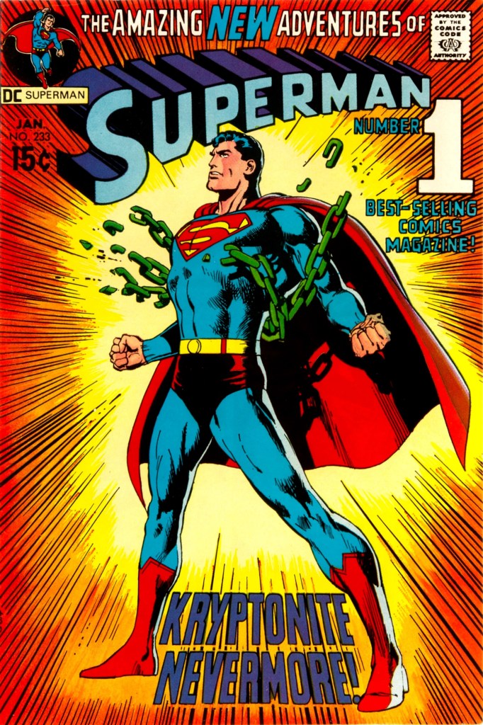
This is one of Adams’s simplest covers. Superman shatters the Kryptonite chain surrounded by action lines. There might not be a lot going on, but this is still one of his most iconic covers. This imagery of Superman breaking the chains has transcended its original story to become a pose that almost everyone has seen adapted in some manner. Heck, there’s little doubt that this cover, along with Superman (1939) #11, inspired the current logo for DC Studios. However, Adams famously disliked how this cover became so iconic, but how could it not? It’s so simple, but so clean. I’m a massive fan of this understated style of cover, but it’s true that other covers capture more of Adams’s technical skills.
7) The Unexpected #113
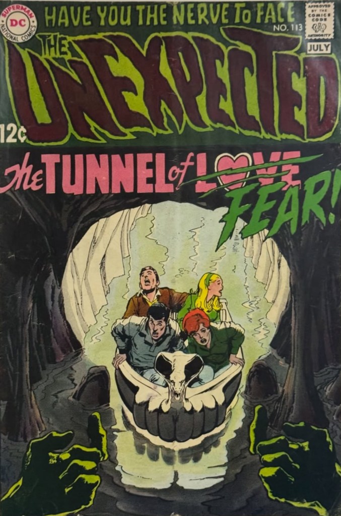
Speaking of technical skill, this cover has that in spades. Using everything in the environment, from the cave mouth to the lighting to the boat, to create the imagery of a skull is downright genius. Something like this can easily be overwhelming or too abstract with such a realistic art style, but Adams makes it work like nobody else could. The rest of the cover deserves its praises, too, as the hands beckoning the teens on elevate the terror at least tenfold. Yet again, Adams proved that he was a master of expression work, with every passenger on the boat ride to terror being so unique in their energy. This skull is downright beautiful, and this is some of Adams’s creepiest work.
6) X-Men (1963) #58
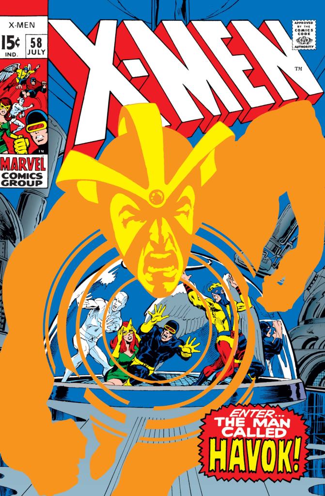
Neal Adams had a short stint as the artist for the X-Men, and he revolutionized the game. The X-Men are trapped in a glass dome, while a massive Havok rushed towards the reader like he was about to pop off the page. The genius in this picture is how Havok’s insignia is used to make it look like the X-Men are trapped in his symbol. Havok’s presence is literally trapping the X-Men and leading them to doom, which is one of the coolest ways to show off Havok’s unique design I’ve ever seen.
5) Green Lantern & Green Arrow (1960) #85

This is the type of cover that shocks you right to your core. You never expect to pick up a superhero comic and see a young man literally preparing to shoot heroin. This entire cover is structured like a page in the book, which is perfect, because it sits you in the scene and forces you to look at Roy while Ollie has his terrible realization. Everything in the background is loose on details, but that just makes the grim situation in the foreground pop more. This is one of the most iconic comic book covers of all, because nobody forgets the first time they saw this image.
4) Green Lantern & Green Arrow (1960) #76
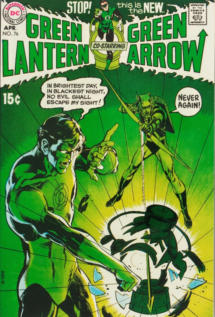
Frankly, this list could be filled with Adams’s catalogue from this run alone, but #76 is special because of just how clean it is. Green Lantern attempting to charge his ring with the classic oath, only for his battery to be shattered by a single arrow, has become an image that everyone in the comic community knows. You can feel the Power Battery shattering with every shard and action line, and the shock on Hal’s face says everything it needs to. This cover is iconic for a reason, and it might be simple, but it has impact.
3) X-Men (1963) #59
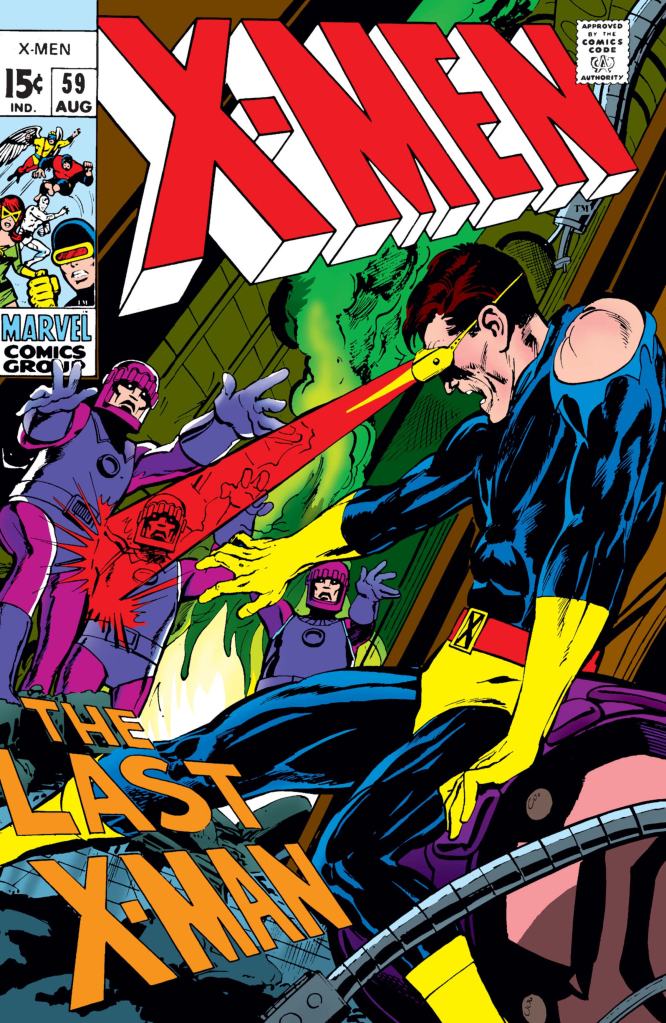
This cover has everything a fantastic Adams cover needs: a unique angle, raw terror so palpable you can taste it, and an excellent showcase of what makes its hero so cool. The Sentinels close in on Cyclops like an army of zombies, while he looks about ready to pass out from exhaustion. He’s at the end of his rope, but still giving it his all, and Adams leverages Cyclops’s powers to have him blast as hard as he can while still showing his terror. Even the title, “The Last X-Man,” being off kilter makes it all feel so much more chaotic and alive. This cover feels like we’re being dropped in the middle of an action movie scene, which is exactly how a superhero cover should make you feel.
2) Strange Adventures #213
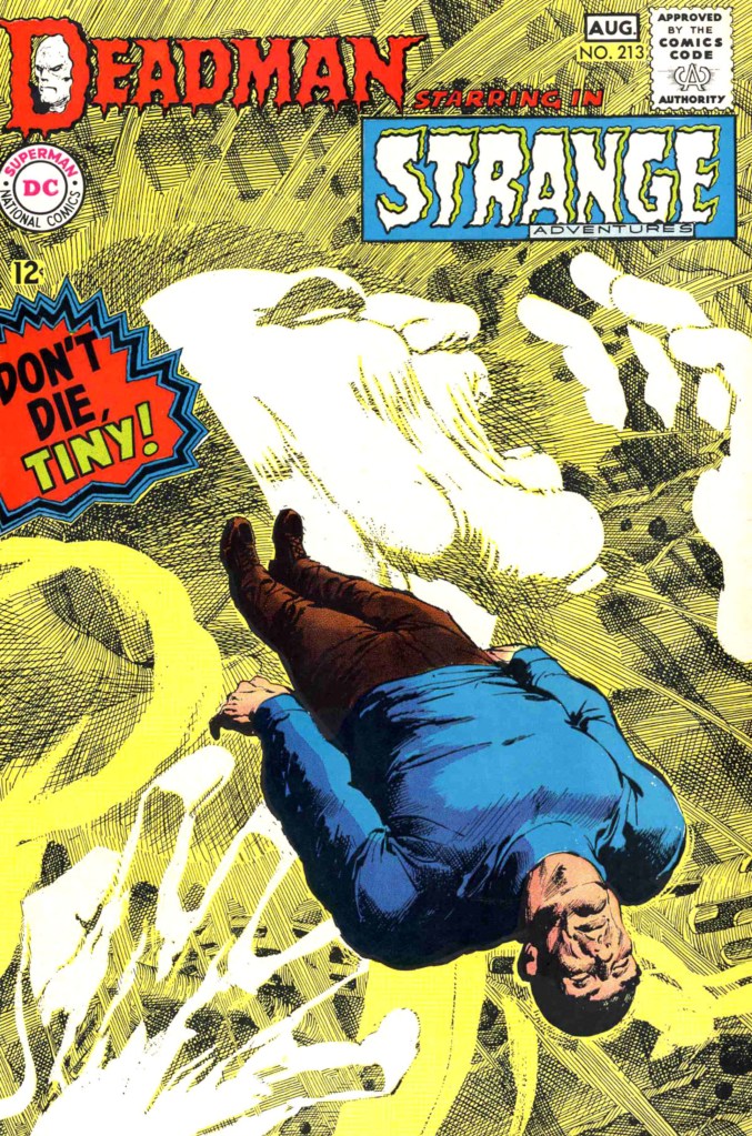
This cover is absolute insanity. Tiny’s position is fantastic, looking both like he’s floating down the river and lying on a slab. Obviously, the real draw is Deadman. This is crosshatching on an unmatched level. It truly makes Deadman feel like a specter, a being of pure spirit that does not belong in this world. He might look like a being from another realm, but his pain is all too familiar, as his scream hits deep in any onlooker’s soul. This cover captures the ultimate eerie, horror-filled atmosphere that all of Adams’s best work does, and it will always remain one of the most impressive and vibrant.
1) Superman (1939) #252
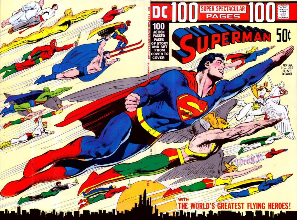
The front and back Fylying Heroes cover is, in my humble opinion, the best non-Batman Neal Adams cover. It features twenty-one of DC’s most prominent flight-capable heroes, all racing off towards the sky. Even with such a high number of heroes, no details are skipped. Hawkman’s wings in particular are downright awesome. Of course, the real star of the show is Superman. His posture is all relaxation, and his expression is such a simple, happy smile. This cover is the definition of peaceful. It’s the quintessential Superman atmosphere, and just a great showcase of how skilled Adams was at making these heroes come alive.
What’s your favorite Neal Adams cover? Superman #242 and Green Lantern & Green Arrow #86 are incredible honorable mentions, but let us know yours in a comment below and join the conversation now in the ComicBook Forum!
More Comics
-

Image Courtesy of DC Comics -
Image Courtesy of Marvel Comics -
Image Courtesy of DC Comics -
Image Courtesy of Marvel Comics