The comics industry never looked so good. 2014 was a marquee year for comic artistry, filled with so many good-looking titles, it was tough not to buy a frame for half the issues in each week’s pull-list.
Videos by ComicBook.com
The past twelve months strayed from the beaten path with styles and storytelling techniques. Indeed, comics pushed the limits of sequential storytelling to new and exciting frontiers. Even the Big Two especially managed to step outside of their comfort zones, breaking free from the normal “house style” of superhero art with fresh and innovative blood.
Picking the top standouts wasn’t easy. Granted, many omissions may later come back to haunt us, but here are the comic books artists who wowed us the most in 2014.
Tradd Moore
All-New Ghost Rider, Secret Avengers Covers
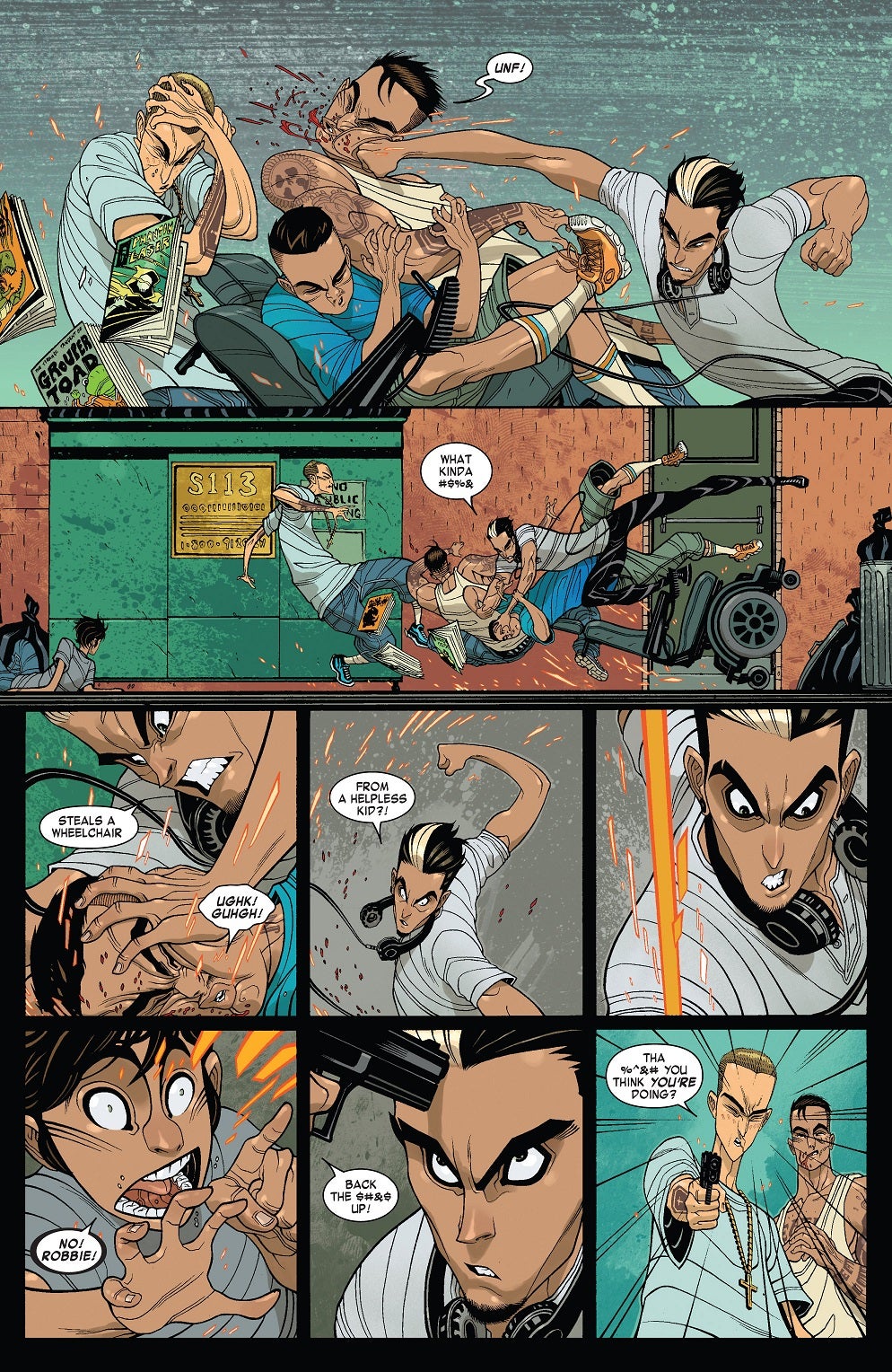
Moore’s cover work and interior pencils on Marvel’s All-New Ghost Rider are a thing of cartoon beauty. Every panel and image that Moore produced this year looks like a still from the perfect animated series that we never received. And even with these cartoonish stylings, Moore still crams tons of detail into his line work. His characters are elastic and exaggerated, bringing dramatic expressions that clearly convey their moods. But Moore can do more than string together pinups. He brings motion and momentum to an otherwise static medium, making a comics reading experience on par with a roller coaster ride.
David Rubin
Battling Boy: The Rise of Aurora West
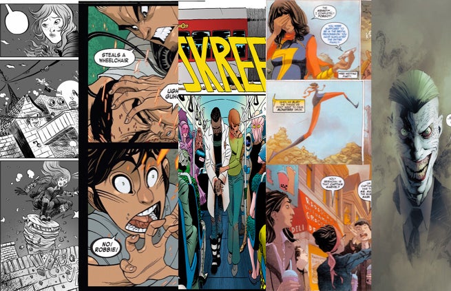
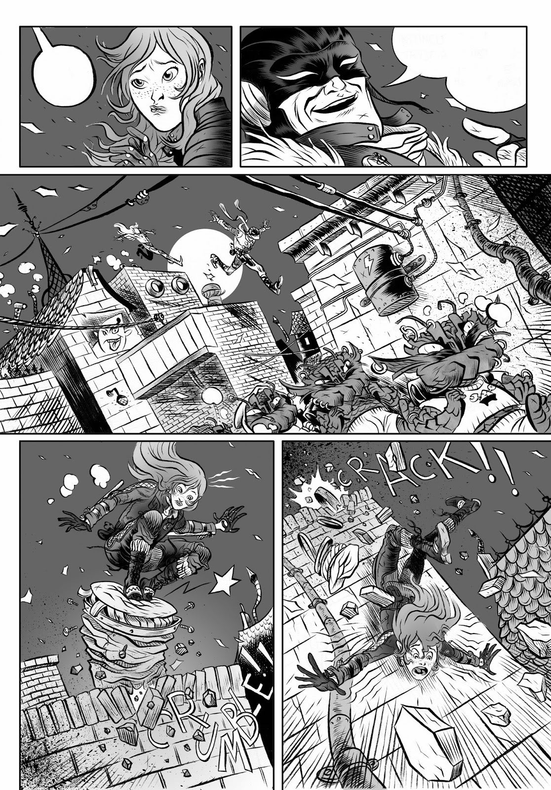
Hand-picked by Paul Pope to help develop his budding Battling Boy universe, illustrator David Rubin didn’t let the iconic comic creator down. Rubin’s work on The Rise of Aurora West certainly echoes Pope’s style in some areas, but he adds just enough distinctions of his own to truly stand out as a pop-art powerhouse. Rubin’s work fuses eastern and western inspirations for a hybrid style that bounces off of the page. But it’s the little details that make each panel such a pleasure. Rubin stuffs them little surprises like flashes of light, sound effects, or puffs of dust that animate each moment of action. With Rubin riding shotgun in Pope’s world, we’re confidant that Battling Boy’s future is in sturdy hands.
Marcos Martin
The Private Eye
The sheer amount of imagination Martin brings to an issue of The Private Eye was enough to grant him a space on this list. The man proves is a designing machine, able to conjure iconic figures that are either deceptively elegant or proudly flamboyant. You can accurately size-up just about any character in Brian K. Vaughn’s futuristic world just by looking at Martin’s characters. That’s only half the fun, of course, as Martin marches Vaughn’s flashy world out like a traveling circus. There’s enough funk and flash within each moment that the world of Private Eye feels like a some dangerous disco: It’s alluring on the surface, but hides a chaos that you’d never want to get too close to.
Greg Capullo
Batman
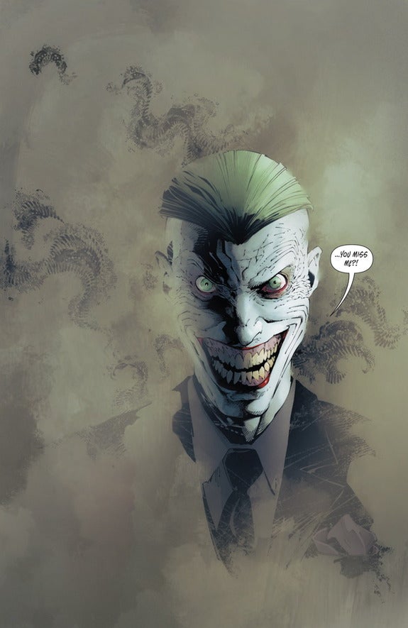
Capullo may not break the mold of what comics are capable of, but you’d be hard pressed to find a industry veteran who keeps improving at his rate. Just compare his current work on Batman to his “Court of Owls” pages two years ago, and you can tell that Capullo is an artist who torches his laurels the moment he’s set them. His nuanced style is tailor-made for Batman, channeling the clear linework of Jim Lee, the grittiness of Frank Miller, and the acute detailing of Neal Adams. He’s also incredibly diverse within his wheelhouse. Between “Zero Year” and “Endgame,” Capullo proved he push a reader’s adrenaline just as easily as he can scare their pants off. While the industry seems to be gravitating towards a brighter style with cartoon influences, Capullo proves that it’s still fun to play in the dark.
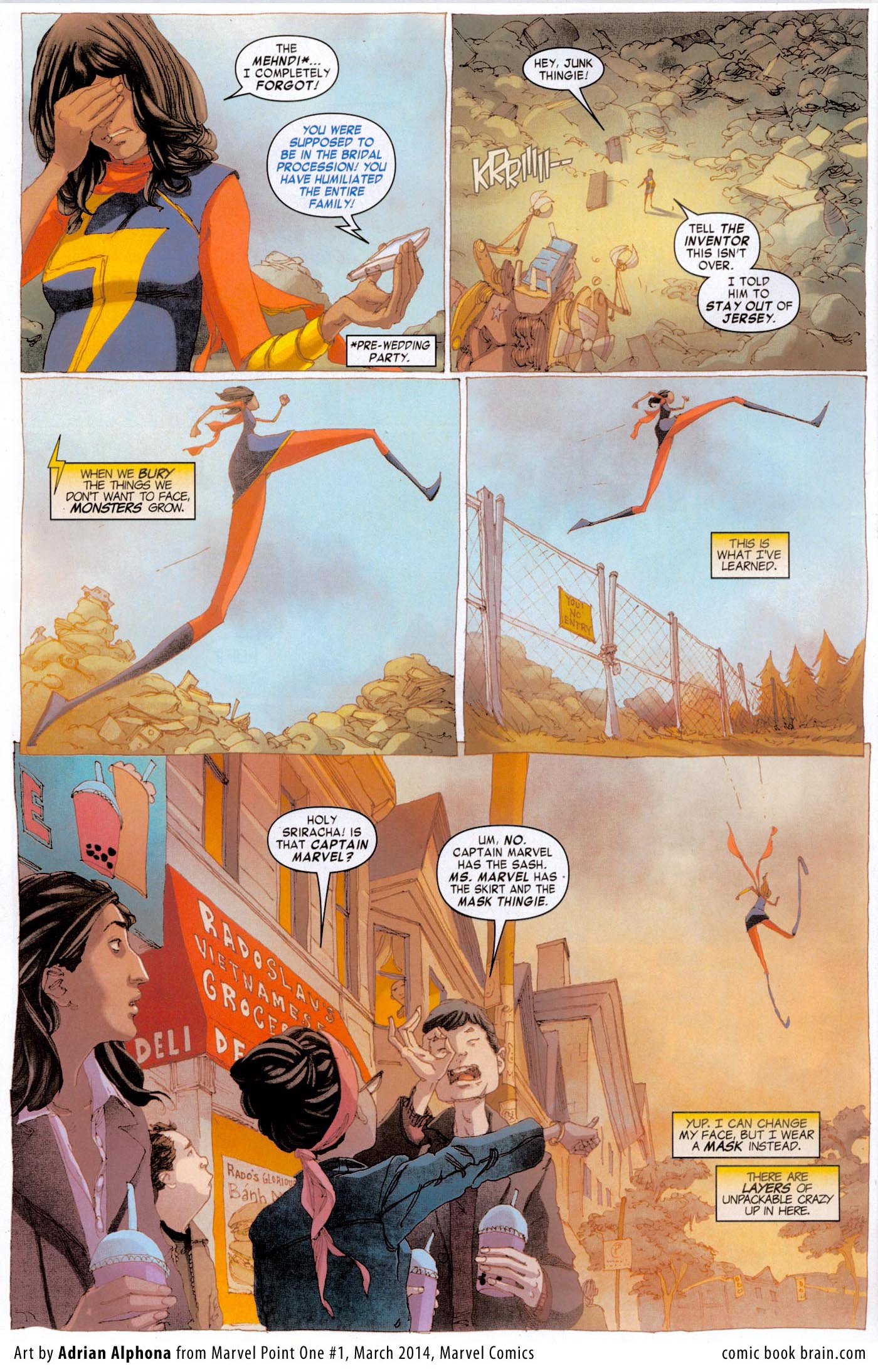
Adrian Alphona
Ms. Marvel
Adrian Alphona is sure to make many “Best Of” lists this year, and for good reason. His work on Ms. Marvel takes G. Willow’s Wilson’s beautiful story and makes it even prettier. It’s hard to think of an artists that’s paired better with a writer and series this year, as Alphona took the youthful optimism and detailed authenticity in Willow’s scripts and translated it perfectly into image. Each page looks like an intricate mural, filled with texture and creative designs that turn Jersey City into an imaginative dreamscape.

