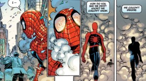
Superheroes live and die based on their designs. Iconic, bombastic costumes that call upon modern fashion trends and classic circus outfits create a unique look that has cemented countless heroes in the mind’s eye. Beloved as they are, most heroes go through redesigns every few years to keep their looks fresh and relevant, and while good ones can reinvigorate love for a book, bad redesigns can absolutely kill enjoyment. Today, we’re looking at five of the absolute worst redesigns Marvel has ever given their heroes, from massive downgrades to genuinely confusing choices that have us scratching our heads years later. Without further ado, let’s marvel at these monstrous designs.
Videos by ComicBook.com
5) Feral Wolverine
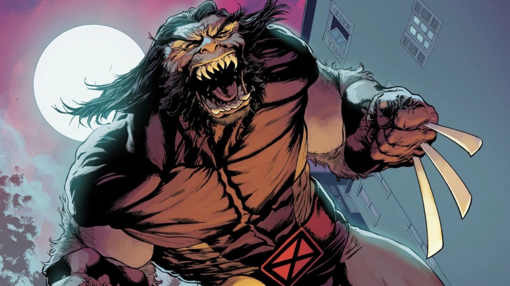
When Magneto ripped out Wolverine’s adamantium in “Fatal Attractions,” it revealed that the yellow-clad hero had bone claws underneath. However, what started as an interesting reveal quickly became a nightmare as Wolverine seemingly devolved into a more animalistic appearance. Apparently, the adamantium was holding back his mutation, which aimed to turn him into a feral beast. The validity of that aside, just looking at this Wolverine is almost disturbing. He looks like a caveman who needs to shave, between his widened face and thick, fur-like hair. Also, why did his nose flatten so much that it practically disappeared? His mutation literally enhances his sense of smell.
Wolverine’s new look did not look good because it emphasized the least interesting parts of him while throwing away the parts that fans actually loved. Yes, Wolverine’s rage and animalistic tendencies are core tenets of his character, but so are his compact, yellow-clad form and simple look. There’s both too much going on and not nearly enough human elements. Wolverine’s feral design is the peak of what ’90s redesigns aimed to do, making everything far too edgy and sharp to the point of ridiculousness. Wolverine has two iconic looks that are both near-equally accepted by fans, and ditching them for something that destroys his mental image was definitely a mistake.
4) Invisible Woman 4-Suit
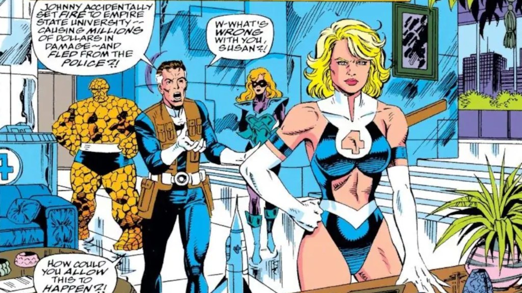
The Fantastic Four wear simple but clean costumes that have nearly endless room for small adjustments and creative redesigns that maintain the spirit of the original, but this is definitely not one of those cases. Superheroines have always had it rough with costumes, with the vast majority being magnitudes more revealing than their male counterparts, and this is easily Sue’s most egregious example, especially considering how she never struggled with this issue before. And oh boy, is this suit the perfect example of that. Seriously, there’s almost nothing here. A ton of superheroines’ costumes could be called swimsuits, but this skips straight to being lingerie.
Why on Earth is the 4-symbol cut out? Why are there arm bands that connect to nothing? This suit really takes after Sue, given that half of it is just straight up see-through. The in-universe reasoning for this design is that she melded with her sentient Malice persona, which was birthed from all of her darkest thoughts and desires, but still, that just feels like a lame excuse to put Sue on display. Fan sentiment seems to have agreed the entire time, given that this suit was quickly replaced and Sue returned to her normal personality.
3) Normal Beast
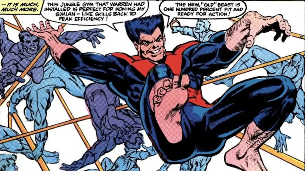
Beast didn’t used to be a big blue fuzzball, as he initially started out as just being bigger than the average person, complete with a brick-wall-style physique. Of course, after his experiments awakened this side of him, it stuck and became a core trait, but he was actually once reverted to his original, human look. It occurred during the original X-Factor (1986) run, which wanted to restore the original five X-Men in every capacity, and that included returning Beast to his original design. Frankly, it’s baffling, given just how much being blue and monstrous-looking adds to his character and his place in the mutant metaphor.
Beast actually looking like a beast makes him ten times more interesting than looking like a bulky man. What was even weirder is that this change was followed by a decrease in his intellect, where he traded his smarts for raw power. That was clearly a band-aid to restore some of the internal drama that was lost when he was made to look normal again, but it just took away another essential character trait in a convoluted way to restore what this design change took away. Beast’s human design isn’t bad, but it definitely made him a worse character.
2) Daredevil Armor

Daredevil’s red costume is one of the simplest and most beloved designs in Marvel, which makes any changes to it especially difficult and subject to ridicule. There have been good redesigns, such as the All-New, All-Different black version, but the armor is not that. In fact, it’s probably the look everyone points to first when talking about terrible redesigns. Simply put, there’s way too much going on here. There’s both too much red and not nearly enough, with the bits that are there sticking out like sore thumbs, given that they’re genuine armor instead of the spandex or cloth that it normally is. The steel bits stick out even harder. Why does Daredevil have forearm spikes, and why can he attach his billy clubs to them?
When people think of Daredevil, they think of acrobatics and ninja adventures. He’s a quick fighter who uses stealth as much as he does his fists, and yet this costume has him lumbering around in armor that wouldn’t look out of place on a modern knight. That’s not even getting into how it’s just not pleasing to look at. The small DD logo looks like it’s printed on in the worst way, and the chest plate juts out in the strangest way to make him look unbalanced. This is Daredevil’s worst look by far, and it’s no mistake that the most recent time it was brought back in Daredevil (2023) #20, it was used as a bondage joke.
1) Post-Armageddon Captain Marvel
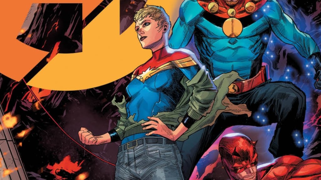
“Avengers: Armageddon” was a massive shakeup for the Marvel Universe, with Red Hulk’s detonation turning the world against superheroes. Captain Marvel was literally at ground zero, and the radiation she absorbed left her depowered and traumatized. That’s the explanation for her new look, but that does not make the pill any easier to swallow. The first change was giving Carol the pixie cut again, which isn’t going to work for her specifically no matter how many times Marvel tries it. That’s the least of the problems here, as Carol now sports the top half of her costume and jeans instead of the lower half. Genuinely, this makes her look like she’s wearing a Captain Marvel T-shirt.
This new look does not work. It’s meant to show that the Avengers have transitioned to being a more grounded team and how much of a low point Captain Marvel has hit, but this is still a bad superhero design, and it’s made even worse by the fact that her previous costume was her best look yet. The jacket and braid combo elevated her look so much and screamed superhero, mixing fashion with classic costume extravagance. Knowing that we lost that design to this one hurts in a way that’s bound to stick around for some time, as we fell from the greatest heights to the depths of jeans on superhero costumes.
Which Marvel hero do you think should never be redesigned, and which character desperately needs one? Let us know in the comments below!
More Comics
-

Image Courtesy of DC Comics -
Image Courtesy of Marvel Comics -
Image Courtesy of Marvel Comics -
Image Courtesy of Marvel Comics -
Image Courtesy of Marvel Comics -
Image Courtesy of DC Comics -
Image Courtesy of DC Comics