Fighting games have always lived and died by their characters. Mechanics matter, balance matters, but nothing pulls players in faster than striking character designs. Some players even pick their mains solely based on how a character looks because they find it cool, intimidating, or completely unlike anything else they have seen. That first impression is powerful, and the best designs stay with you long after the match ends. They become icons that define not just a game, but an entire series.
Videos by ComicBook.com
What makes a design truly great is not just how it looks, but how it communicates identity. The best fighting game characters tell you who they are before they even throw a punch. Their outfit, stance, and silhouette all work together to create something instantly recognizable. Some designs remain consistent across decades, while others evolve without losing their core identity. That balance is rare, and it is what separates good designs from legendary ones. These five characters exemplify what it means to maintain a good and consistent design across multiple games.
5) Ryu – Street Fighter
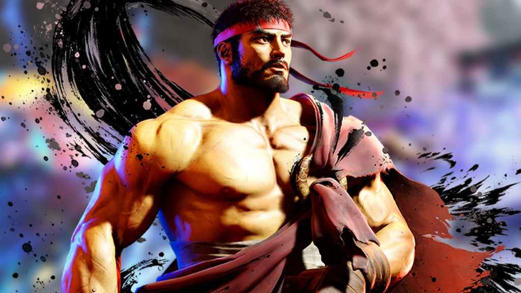
Ryu is one of the most recognizable characters in gaming history, and his design proves that simplicity can be powerful. Introduced in Street Fighter, Ryu’s white gi, red headband, and gloves create a clean and focused look that reflects his disciplined personality. There is nothing excessive about his design, and that is exactly why it works.
I, and many other fans, have always appreciated how Ryu’s appearance matches his role. He is not flashy or overdesigned. He represents the pure essence of a martial artist. When you see him, you immediately understand that he is about skill, training, and control. That clarity is something many modern designs struggle to achieve.
What is impressive is how little Ryu has changed over the years. While other characters have undergone dramatic redesigns, Ryu has remained consistent. Small updates to his physique or details have kept him fresh, but the core design has never been lost. Even though Street Fighter 6 updated his look, it still reflects his core character. That consistency is a big reason why he remains iconic.
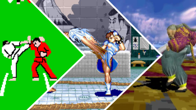
4) Mai Shiranui – King of Fighters

Mai Shiranui is one of the most recognizable characters from The King of Fighters and Fatal Fury. Her design blends traditional Japanese influences with a bold and confident presentation that immediately stands out. There is no doubt that she brings the sex appeal to the series and stands out among the genre’s female characters, with many believing she played a major role in inspiring the Dead or Alive series, where she also appears as a guest character.
Mai’s outfit is iconic, but it is not just about appearance. It reflects her personality as a confident and skilled kunoichi. Her movements, expressions, and animations all reinforce that identity. Her design strikes a balance between style and character in a way that few others manage, even if the fan service is played up a bit.
Over the years, Mai has remained visually consistent, which has helped maintain her status as a fan favorite. While some characters lose their identity through redesigns, Mai’s core look has stayed intact. That consistency has allowed her to remain one of the most recognizable figures in fighting games. Even when games give her a new outfit, her classic costume always remains.
3) Sol Badguy – Guilty Gear
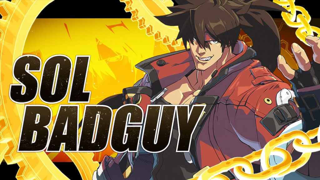
Guilty Gear is easily one of the most stylish series in the fighting game genre. And while many of its characters could appear on this list, Sol Badguy is a perfect example of a design that embraces chaos while still feeling cohesive. His red outfit, oversized weapon, and aggressive stance immediately communicate his personality. Sol is one of the best examples of an over-the-top design that just works.
Many players are drawn to Sol because of how different he looks compared to other fighting game characters. He has a rough, rebellious style that fits perfectly with the tone of Guilty Gear. His design is busy, but it never feels overwhelming because every element serves a purpose. At first glance, some players could easily perceive him as the villain of the story rather than the hero, showing the power of his design.
What makes Sol stand out is how his design evolves alongside the series’ art style. Guilty Gear is known for its striking visuals, and Sol remains at the center of that identity. Even as the series has moved to more advanced graphics, his design has adapted without losing its core appeal and showcases the varying art styles of the series perfectly.
2) Nightmare – SoulCalibur
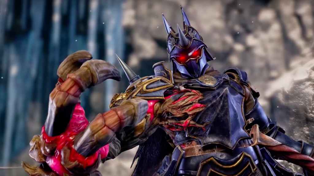
Nightmare from SoulCalibur represents the opposite end of the design spectrum. Where Ryu is simple and grounded, Nightmare is complex and imposing, though it never strays into being too ridiculous. His massive armor, monstrous arm, and glowing eye immediately establish him as a force of pure evil. You can also see how the Azure Knight started off as Siegfried and developed its own identity.
The first time I saw Nightmare, I was struck by how intimidating he looked. Everything about his design is exaggerated to create a sense of power and corruption. The living armor and the cursed sword Soul Edge work together to make him feel less like a person and more like a walking nightmare, fitting his name. In a game with many great designs, Nightmare stands out.
What makes his design so effective is how it evolves while staying true to its core. Across different entries in the SoulCalibur series, Nightmare’s appearance has changed, but the themes of corruption and overwhelming strength remain. His design shows how Soul Edge corrupts Siegfried and the deepening evil of his character. It is a great example of how to update a character without losing what makes them special while also staying true to the series’ world and narrative.
1) Double – Skullgirls
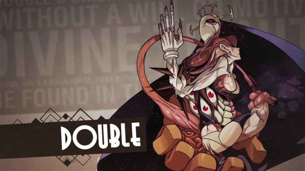
Skullgirls may be a single-entry game, not counting the 2nd Encore rerelease, but it has some of the best designs in the genre. Among them is Double, easily one of the most unique designs in fighting game history. Her design is intentionally unsettling, and I recall the first time I encountered her, not even knowing what I was looking at. That confusion is part of the design, but it is incredibly intentional.
It is meant to feel unnatural, and it succeeds in a way that few characters do. The fact that her base form is a nun only reinforces this. There is no mistaking her for a villain in Skull Girls, and this further shows how powerful her design is. Even though there was no sequel or spin-off game, Double’s design stands the test of time and remains recognizable to anyone who is familiar with Skullgirls.
What makes Double so memorable is how its design ties directly into gameplay. Her ability to mimic other characters reinforces her identity as something unstable and ever-changing. It is a great example of how visual design and mechanics can work together to create something truly unique. Seeing her shift her form mid-combo and taking on the appearance of other characters is just as incredible today as it was back then.
What do you think? Leave a comment below and join the conversation now in the ComicBook Forum!
More Gaming
-

Courtesy of Game Freak -

Courtesy of The Pokemon Company -

Courtesy of 343 Industries -

Image Courtesy of Warner Bros. Games