There are over 1,000 Pokémon now, thanks to Scarlet and Violet. Since 1996, there have been so many different creatures introduced. Some of them have really brilliant, clever designs, like Hawlucha, Incineroar, Mewtwo, and Greninja. In those instances, The Pokémon Company was clearly inspired. Not all of them are hits, though. There have been a few glaring misfires in pretty much every single generation, with some being worse than others. From lazy, uninspired designs to just flat-out ugly Pokémon, these are the worst five that somehow passed and got approved before being inflicted on the gaming world.
Videos by ComicBook.com
5. Bruxish

Bruxish is one of the worst Pokémon designs out there. It is based on a real fish, the Humuhumu-nukunuku-apua’a, which is the state fish of Hawai’i. However, The Pokémon Company started with a bad source and made it even worse. The colors don’t work, nor does the design of the Pokémon. It draws inspiration from other reef fish, too, but the end result is just really bad. Fish with teeth are real, but they’re ugly in the real world, so it made very little sense for Game Freak to go down this path and retain all of the worst features to make a fictional version.
4. Klink

Klink is one of the few incredibly lazy designs that the Pokémon series has had over the years. It’s one thing to make a Pokémon based on an inanimate object; it happens all the time and can be good. But when you take cogs/gears from a machine and do not even change one thing on them to make this Pokémon, you end up with a pretty bad design. It is baffling how no one involved in this thought that the design needed to be a little more out there because Klink has nothing interesting going for it. Most Pokémon are based on something, but sometimes it’s harder to tell, or they have some unique aspect. Neither thing is true for Klink, though.

3. Voltorb
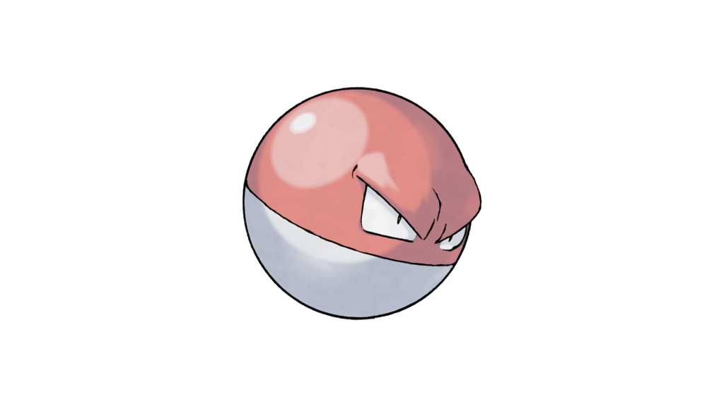
The one thing Voltorb has going for it is good eye design. The colors are boring, and the lack of distinguishing features is very disappointing. It doesn’t even have a mouth, which is akin to an animal not having a mouth. How does it feed or talk? It evolves to have a mouth, which indicates that the design choice here is just plain confusing. It’s a Pokéball with eyes, essentially, but designing a Pokémon based on the very thing they’re captured in is a great premise. It feels like Game Freak just really phoned it in on Voltorb, despite there being tons of potential for something good or at least interesting. Instead, we get maybe the most boring Pokémon there is. Voltorb seems angry, but with no mouth, it cannot express that in any way.
2. Seel
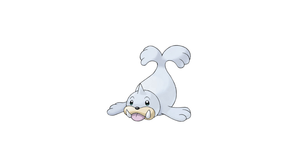
Seel is more evidence that the bad Pokémon designs are not a recent trend. Later generations get a lot of flak, but many of the original Generation I Pokémon are pretty uninteresting. Seel is a prime example. It’s literally just a seal with a horn. There’s no interesting color and no other additional feature, when there were tons of opportunities for that. Seel is the epitome of copying homework but changing it a little. The shiny is pretty awful, too, so maybe GameFreak just had a particularly difficult time with this one. It’s still surprising that no one thought that this Pokémon needed a little something extra when coming up with the design. Maybe they were testing the waters about how much they could get away with.
1. Probopass
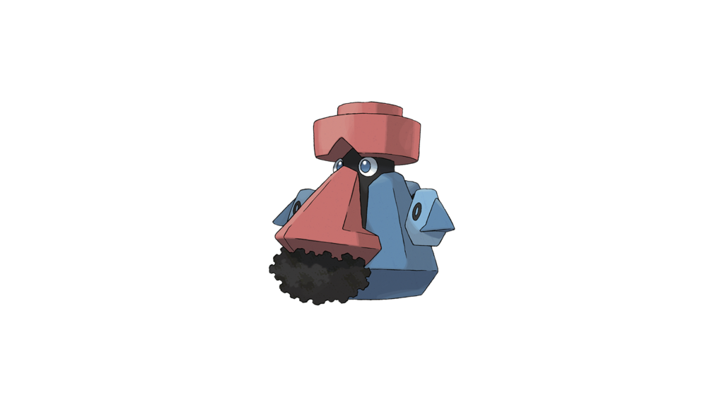
Probopass might have the most mindboggling design of any Pokémon. How this got approved is beyond me. It’s ugly, and it certainly seems to be based on some stereotypes. The facial hair on Probopass also just makes no sense, either. Other Pokémon don’t have facial hair, and it wasn’t present on Nosepass. It could make sense as evolutions often equal aging, but other Pokémon don’t have overt facial hair like this that is meant to reflect real people. It’s a genuine eyesore.
What do you think? Are these the worst, or are there some we missed? Let us know in the comments down below!
Most Viewed
-

Warner Bros. Animation / Cartoon Network Studios -

Courtesy of The Pokemon Company -

Courtesy of Square Enix