When a certain Mr. Spock first graced our screens on Star Trek: The Original Series in 1966, little did audiences know that they had just been introduced to one of the most iconic characters in television history. With his trademark pointed ears and eyebrows, and that calm and calculating demeanour that’s become so synonymous with the character, we can now literally describe someone as ‘Spock-like’, Leonard Nimoy’s beloved Vulcan captured our hearts and is still being enjoyed in his many iterations by fans nearly 60 years later. But what if we told you that things could easily have turned out differently, and Spock’s classic look was very close to being wildly different?
Videos by ComicBook.com
With his unique features and bowl cut (admittedly a bold fashion choice, but hey, if the Beatles can rock it…) Spock was instantly recognizable as an alien, even if his heritage wasn’t addressed immediately — but he was never so alien that viewers couldn’t connect with him on a human level. However, even the most die-hard Trekkies may not know that this healthy balance was actually the result of a last-minute design change that might just have saved Star Trek from entirely sabotaging itself before it even had a chance to shine. Because in the earliest stages of development, Spock was almost red instead of green.
The Conundrum: Making Spock Obviously Alien

Yes, you heard that correctly, the famous ‘green-blooded hob goblin’ as affectionately coined by Dr McCoy, was very close to having more of a crimson complexion. During Star Trek’s precarious formative years, when creative decisions could make or break the show, Gene Roddenberry and his creative team were faced with a fundamental problem when it came to deciding on a design for their Vulcan first officer: how does one quickly and easily visually communicate to viewers that a being is “alien” on a tight budget? After all, there weren’t many examples to go off at the time.
Elaborate prosthetics weren’t feasible for a weekly series with a low budget, and Roddenberry wanted Spock— who was seen as being a key part of the show as the ‘alien’ component of the crew, to stand out. As the ship’s resident Vulcan, Spock would serve as an important bridge between audiences (and humanity within the show) and the many alien species they would encounter on the Enterprise’s travels — he was intended to be a representation of the multi-species society the people of the future would exist in, showcasing the best of our intergalactic allies and the possibilities of peaceful coexistence.
The solution initially seemed straightforward. Early concept art envisioned Spock with a crimson complexion, which, paired with his now-famous pointed ears and upswept eyebrows, would have made for a striking look. The thinking was simple: a bold color choice would hopefully instantly let audiences know that this was a character who wasn’t from our world, but without requiring bulky costumes or elaborate masks (we hadn’t quite discovered the full potential of the Klingons at this point).
There was nothing wrong with this idea in principle. In early make-up tests, the effect seemed to work, Nimoy looked just the right balance of exotic, mysterious, and otherworldly, yet distinguished (even if early sketches did make him look somewhat more like a mischievous imp from medieval folklore). However, no one had fully accounted for how the red makeup would translate on actual television screens.
Star Trek’s Issue With Black and White TV
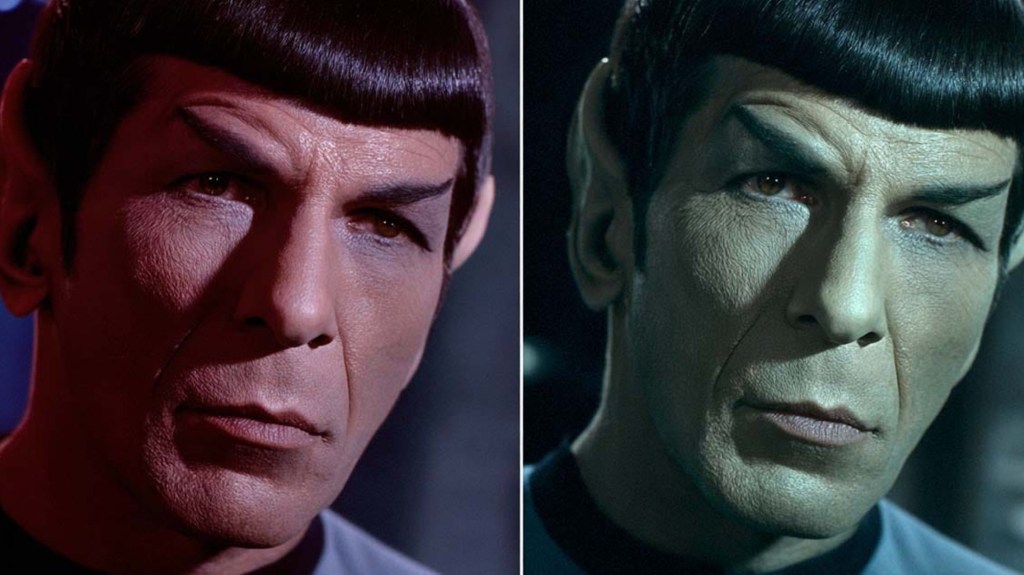
By the mid-1960s, color television was becoming more common in households across the U.S., but it was still far from the norm. A large proportion of Star Trek’s potential audience would still have been watching the show in good old black and white, and this was apparently something the designers of Spock’s look forgot to bear in mind…. When the initial tests were conducted with Nimoy donning the red make-up, the results were rather alarming.
On color cameras, the red makeup showed up as intended just fine, but on black-and-white sets, it had a somewhat different effect. Instead of just making him look “alien,” in black and white, the make-up rendered Nimoy’s face completely dark, obscuring his lines and curves and turning his face into an almost featureless mask. All his iconic subtle facial expressions were hidden by shadow, and combined with his sharp eyebrows and pointed ears, the effect was unsettling to say the least. Rather than simply denoting a different species, Nimoy looked almost demonic.
There was a growing interest in and rising concern surrounding the occult and all things satanic amongst the American population in the 1960’s (which later gave rise to the so-called “Satanic Panic” of the 80’s). NBC executives reportedly worried that viewers, especially parents still needing to be convinced of Star Trek’s suitability for their kids, would interpret a now beloved character as satanic imagery. For a network already nervous about Star Trek’s fresh tone and unconventional storytelling, this wasn’t a risk they were willing to take. The series was already boldly going into new territory, and the potential alienating of audiences with ‘demonic imagery’ from the very first episode needed to be avoided.
The Design Pivot That Saved A Franchise

Thankfully, with the red concept now abandoned, the production team opted for something far subtler, and Spock’s final look became the faint greenish tint we know today — just enough to suggest that he wasn’t entirely human, without overdoing it. The in-universe explanation of course, that later became canon, was that Vulcans had copper-based blood, giving their complexion a slightly different hue. This new design achieved exactly what Roddenberry wanted. Spock remained visually distinct, but not distractingly so. He looked alien, but not disturbing, and remained intriguing and relatable to viewers.
But more importantly, the toned-down makeup allowed Nimoy’s performance to take centre-stage over the characters look. Without the extreme appearance defining Spock, Nimoy was able to convey the character’s distinct personality through his posture, speech, and mannerisms. His carefully controlled demeanour, clipped delivery, and piercing gaze did far more to sell Spock as a deeply conflicted and rich character with a complex upbringing, than overly complicated prosthetics could ever have.
Why a Red Spock Would Have Broken Star Trek

It might not have seemed like that big a deal at the time, more a practical choice, but it’s fascinating to think how much that early design change may well have altered Star Trek’s legacy and even shaped the entire history of the franchise as we know it today. Despite its success nearly 60 years later, The Original Series struggled to cement its audience during its initial run, frequently battling low ratings and network skepticism and eventually being relegated to the dreaded Friday night slot (when typically no one was home to watch) and later cancelled by executives who had lost faith in the show. While its popularity increased through broadcast syndication in the 70’s, sparking later spin-offs and turning Star Trek in to the cultural phenomenon we know today, it’s largely thanks to Nimoy’s endlessly charming take on the role and the timeless friendship between Kirk and Spock that lead to the show being beloved by so many. It’s a small thing, but a Spock who looked overtly scary might have had the opposite effect.
Imagine Spock portrayed without all those subtle changes in facial expression, the little quirks Nimoy imbued him with that made the character so charming and relatable. Imagine seeing him interact with Kirk, all those timeless and cherished scenes between this iconic pair, but without the obvious care and affection and wordless communication between them. A Spock who, quite frankly, looked a little disturbing, would have been pretty hard to relate to and would have struggled to achieve the same effect, and could easily have pushed the show into campy territory, reinforcing the perception at the time, that science fiction television was simply childish and full of silly monsters.
Instead, Spock became something revolutionary: an alien who was somehow even more human than the best of us, the embodiment of logic, dignity, and emotional complexity. Viewers weren’t distracted by unrealistic makeup and instead were drawn into his internal conflict as a half-human, half-Vulcan.
Had the original design prevailed, Spock might have been remembered as something of a novelty, just an oddity from a forgotten 1960s sci-fi experiment. Instead, he became the soul of Star Trek, solidifying the future success of the show and inspiring generations of fans and helping legitimize science fiction as a space for impactful storytelling.
As things stand, the abandoned red-design Spock, is now remembered as a fascinating “what if” in television history – and it’s a good thing too, as it’s a reminder of how fragile great ideas can be in their earliest forms. It’s probably tempting to go for bold, eye-catching choices when it comes to creating new characters, but Star Trek proves it’s not necessarily always about spectacle.
By taking a step back and trusting performance over visuals, Roddenberry and his team allowed Spock to become timeless. The character’s power was never in how he looked, but in how deeply beloved he became.
What do you think? Leave a comment below and join the conversation now in the ComicBook Forum!
Most Viewed
-

Courtesy of Sony Pictures Animation / McDonald's -

Courtesy of Sony Pictures Animation / McDonalds -

Images courtesy of Warner Bros. Pictures -

Image Courtesy of Netflix -

Image courtesy of The Pokemon Company -

Image Courtesy of Marvel Comics