Water has been one of the defining elements of the Pokemon series since the franchise began with Pokemon Red and Blue. Its Pokemon are commonly found in oceans, rivers, and even deep under the sea. Pokemon Winds and Waves hints at a focus on water-based biomes, which should deliver some incredible Water-type Pokemon. But the series has already delivered on this front through fish, marine mammals, crustaceans, and more. At the same time, however, Game Freak has dropped the ball on some of its Water-type Pokemon designs.
Videos by ComicBook.com
Over the years, titles like Pokemon Gold and Silver, Pokemon Black and White, and Pokemon Scarlet and Violet have introduced dozens of interpretations of aquatic life. Some are elegant and instantly recognizable. Others struggle to visually communicate their connection to water, or simply disappoint in their appearance. Looking purely at visual design reveals which creatures truly embody the water element and which ones feel disconnected from it. With that in mind, these are the five best and worst-looking Water-type Pokemon designs in the series.
5) Worst Designed Water-Type Pokemon – Simipour
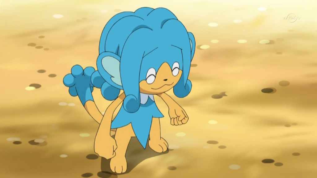
Simipour debuted in Pokemon Black and White as part of a trio of elemental monkeys. The concept behind the group was simple: each monkey represented a starter type through visual cues and elemental attacks. While the idea was clear, the execution of Simipour’s design and its partners leaves much to be desired when evaluated strictly as a water type and compared to other Water-type Pokemon.
The creature’s design focuses heavily on its large, stylized hair tuft that resembles a fountain of water. This is meant to represent flowing liquid, but the exaggerated shape makes it look more like cartoon hair than an aquatic feature. Outside of that detail, Simipour resembles a typical monkey with very little to connect it visually to bodies of water. The design feels like a standard mammal with water-themed styling rather than a creature shaped by aquatic environments.
5) Best Designed Water-Type Pokemon – Araquanid
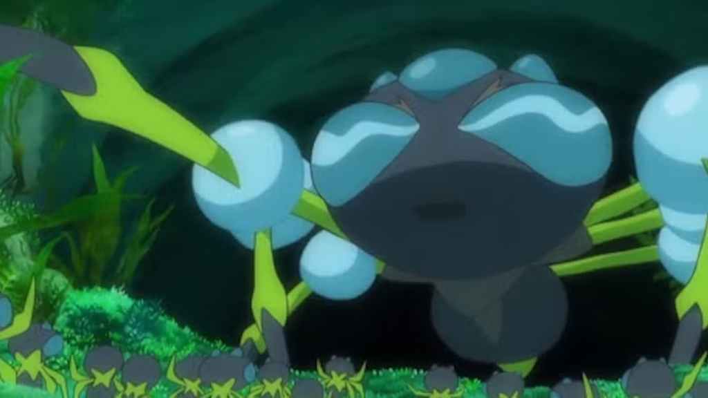
Araquanid, introduced in Pokemon Sun and Moon, presents one of the most creative interpretations of water in the series. The creature resembles a spider that carries a large bubble of water around its head. This bubble functions as both protection and a hunting tool. It is heavily inspired by, if not 100%, the diving bell spider. This blend of real-world science and fantasy creature design makes it incredibly unique and stands out compared to other Water-type Pokemon.
Real-world diving spiders trap air bubbles underwater to breathe. Araquanid expands that idea by turning the bubble into a massive aquatic helmet. The result is a creature that feels believable within the ecosystem of the Pokemon world while still looking unique. Water and Bug is also a great combination that felt underused after Surskit dropped the type combination upon evolving. Its reintroduction in Pokemon Sun and Moon’s island region adds to its impact on the series.

4) Worst Designed Water-Type Pokemon – Barbaracle
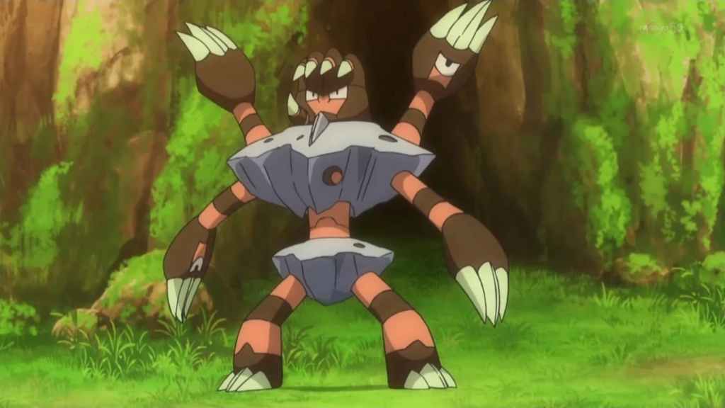
Barbaracle arrived in Pokemon X and Y with a concept based on barnacles. The inspiration clearly connects to ocean life, but unfortunately, the final design feels cluttered and confusing. The creature consists of multiple hand-shaped heads emerging from a rocky structure. Each limb has its own face, which creates a chaotic and disturbing visual. While barnacles are naturally strange animals, the exaggerated shapes make the design difficult to interpret at a glance.
From a Water-type perspective, the rocky structure dominates the appearance more than the aquatic aspects. It looks more like a living rock formation than a creature shaped by tides or currents. The marine inspiration is present, but the visual complexity distracts from the water theme. Had Game Freak toned down its appearance, it would have made a better design. Giving it more water-based elements rather than what we got would have completely changed how Barbaracle was accepted by Pokemon fans.
4) Best Designed Water-Type Pokemon – Finizen

Finizen, introduced in Pokemon Scarlet and Violet, demonstrates how simplicity can produce a strong elemental design. The creature resembles a friendly dolphin with smooth curves and a streamlined body. That’s it, no gimmicks or weird design choices. Fans have always wanted a dolphin Pokemon and this first-stage Pokemon delivered on that. The design emphasizes shapes that suggest speed and movement through water.
Another strength of the design is its clean silhouette. Finizen looks natural within the Pokemon world because it is not overloaded with extra details. It captures the essence of an ocean-dwelling creature while still fitting the stylized aesthetic of the series. Its simplicity makes it feel like a Generation 1 Pokemon. Game Freak finally answered the dolphin-loving fans with this Pokemon, and a strong evolution would have solidified it as one of the best-looking Water-type Pokemon evolution lines.
3) Worst Designed Water-Type Pokemon – Inteleon
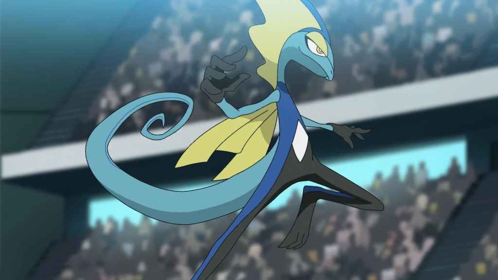
Inteleon, the final evolution of the water starter in Pokemon Sword and Shield, takes a very different approach compared to traditional aquatic designs. The creature resembles a thin, upright lizard styled after a spy or secret agent. The design emphasizes personality traits such as finger guns and a dramatic pose. While those elements help define the character, they also overshadow the water theme. The body shape and stance look closer to a cartoon spy than a creature adapted to aquatic environments.
What’s more is that Inteleon continues the horrible trend of Pokemon starters leaning into more humanoid designs. While the spy motif dominates the concept, and this makes sense, it takes away from the designs of its pre-evolutions. Combining this with its overall lack of water elements, Inteleon is another disappointing Water-type Pokemon that could use a redesign, but will never get one.
3) Best Designed Water-Type Pokemon – Blastoise
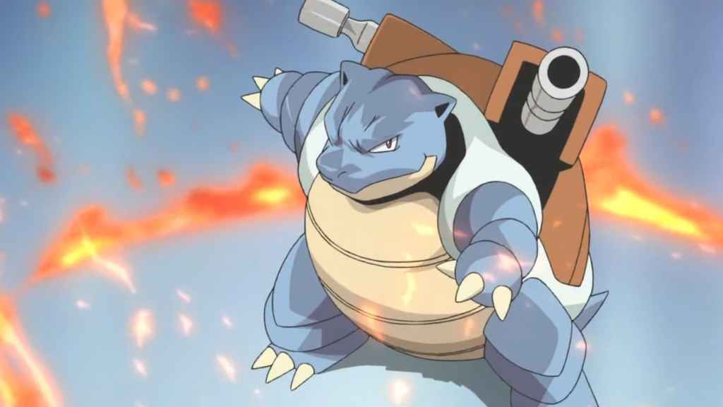
Blastoise debuted in Pokemon Red and Blue and quickly became one of the most recognizable and iconic Water-type designs in the franchise. It resembles a massive turtle equipped with powerful water cannons mounted on its shell. The design communicates water power through those cannons, perfectly capturing the idea of Hydro Pump by firing massive jets of pressurized water. Combined with the turtle inspiration, the creature feels like a living fortress built around aquatic strength.
The shell also reinforces the aquatic theme. Turtles are naturally associated with bodies of water, so the connection to water feels natural. Blastoise balances realism with fantasy, creating a design that looks powerful without losing its link to marine life. There is a simple elegance in its design that makes it perfect to represent Water-type Pokemon. It also fits the designs of its pre-evolutions and the theme of Generation 1.
2) Worst Designed Water-Type Pokemon – Bruxish
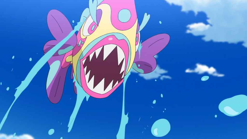
Bruxish was introduced in Pokemon Sun and Moon and immediately stood out for its extremely bright colors and exaggerated facial features. The creature is based on reef fish, which are known for vibrant patterns, but the design pushes that idea to an extreme. To put it simply, Bruxish is just ugly. The large lips and sharp teeth create a strange appearance that distracts from the aquatic inspiration. While reef fish can look unusual, Bruxish’s expression gives it a somewhat chaotic look that is unsettling.
From a water type perspective, the fish aspect does communicate the element. However, the overwhelming color palette and exaggerated face dominate the design. Instead of highlighting the elegance of ocean life, particularly the strange beauty of the reef fish, Bruxish feels goofy and out of place amongst Pokemon designs. It should have toned down the odd facial features and gone with more fish-like elements.
2)Best Designed Water-Type Pokemon – Vaporeon
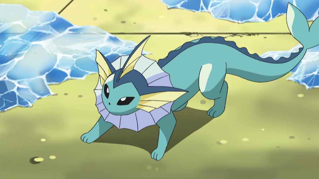
Vaporeon, introduced in Pokemon Red and Blue, represents one of the most elegant Water-type designs ever created. The creature resembles a sleek aquatic mammal with fins and a smooth tail designed for swimming. The fin around its neck and the long mermaid-like tail immediately identify it as a Water-type Pokemon, and the design suggests a creature that can glide effortlessly through water, reflecting the fluid nature of the element.
Another strength of the design is its simplicity. Vaporeon uses clean shapes and soft colors that resemble calm water. It does not rely on weapons or complex features. Instead, it communicates the element through graceful aquatic anatomy. With it being an Eeveelution, it has a lasting impact on fans and remains amongst the most popular Pokemon in the series. Like Blastoise, it has become a mascot of the type and even has the stats to back up its popularity.
1)Worst Designed Water-Type Pokemon – Palafin
Palafin, introduced in Pokemon Scarlet and Violet, is based on a dolphin with a superhero transformation. While the concept adds personality to the creature, it creates confusion when evaluating the design strictly as a Water-type. The regular form resembles a fairly simple dolphin, identical to Finizen, but the transformation into a muscular superhero changes the whole concept. The heroic pose and exaggerated muscles resemble a comic book character more than an aquatic creature.
Players have always wanted a dolphin Pokemon, and Finizen delivered. But the transformation into Palafin’s Hero Form completely takes away any appeal toward the Pokemon. It also pulls attention away from the water theme. Had Game Freak simply leaned into the dolphin aspect with this evolution, we could have had an excellent Water-type evolution line. Palafin Hero Form is easily one of the worst things to come out of Pokemon Scarlet and Violet, and among the worst-looking Water-type Pokemon.
1) Best Designed Water-Type Pokemon – Kyogre
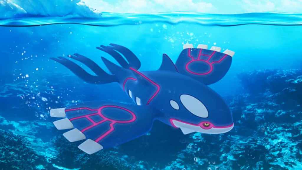
Kyogre, introduced in Pokemon Ruby and Sapphire, represents one of the greatest visual interpretations of the ocean in the entire series. The legendary creature resembles a massive whale inspired by real-world marine giants. The wide fins and streamlined body capture the scale and majesty of ocean life. The blue coloration with glowing red patterns resembles bioluminescent markings often seen in deep-sea creatures. This combination makes Kyogre look ancient and powerful and represents a variety of water biomes.
What truly sells the design is its connection to the sea itself. Kyogre is said to expand the oceans, and its appearance reflects that immense power. The creature looks like it belongs in the deepest parts of the ocean, embodying the vastness and mystery of water. Its Drizzle ability even summons the rain when it enters battle, further reinforcing its typing. Game Freak nailed Kyogre’s visuals and its representation as a legendary Water-type Pokemon.
What do you think? Leave a comment below and join the conversation now in the ComicBook Forum!